Klopp - Paper - Scissors
A few weeks ago I saw this dumb (in the best way) tweet and thought “hey, what if we could try and test that?”:

So I hacked something together to take see if I could find and estimate some effect along these lines.
It turns out this was a fantasy. But I think the method itself is interesting enough, and the sunk cost fallacy is a decent motivator so I’m going to blog about it anyway.
Method
The method I went with had two basic stages:
- Place teams into groups based on their playing styles.
- Estimate the effect (if any) that these groups have on match outcomes.
Team clusters
The estimated clusters came out like so:[1]
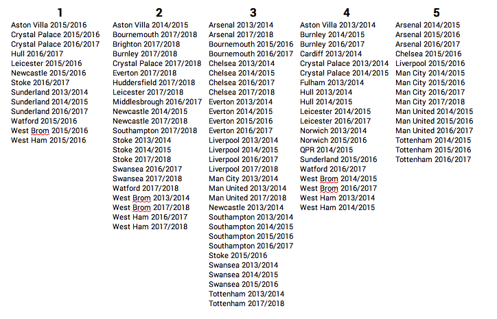
I think these clusters are actually pretty poor for a few reasons (and I’m sure more tactically astute football fans can find more).
Cluster 2 is made up primarily of 2017/18 teams (everyone aside from the top 5!). I think a bit of seasonal grouping is understandable; tactical trends are a thing, and teams don’t adopt a given style independently of the rest of the league. However, this is a big warning sign to me. I think it may also be a sign of changes in data collection practices[2].
I also find it a hard to rationalise some of the differences in clusters, particularly between group 1 and 4. That said, this may be my lack of knowledge on the Premier League midtable of recent years. If you have any thoughts, I’d be interested to hear them, so please don’t hesitate to let me know.
That said, making cromulent clusters is hard, and although some methods (for instance, this series of blogs from Dustin Ward in 2015, or David Perdomo and Bobby Gardiner’s work at this year’s Opta Pro forum) look more convincing, I didn’t see any that I desperately wanted to steal take inspiration from.
Effect on match outcomes
The second part of the analysis was to see if we could use these clusters to isolate any effect that the interaction between team styles is having on match outcomes (like a game of rock-paper-scissors).
To check that any effect is meaningful, we first have to see if including the team cluster information actually improves the model. To do this I set up 4 different models to compare:
- Intercept only - This model has no information except the overall frequency of home wins, draws and away wins.
- Clusters only - This model only “knows” which cluster each team belongs to.
- Team strength only - This model uses clubelo team strength estimates.
- Team strength and team clusters - This model uses clubelo team strength estimates and which clusters the team belong to.
I then ran each of these models through a 10-fold cross validation:[3]
| Model | CV score |
|---|---|
| Intercept only | 0.456 |
| Clusters only | 0.527 |
| Elo only | 0.539 |
| Elo and clusters | 0.541 |
The clusters are clearly giving us some information (they outperform the benchmark), but this seems likely to be due to the clusters picking up on some team strength signal. It’s clear that clusters 3 and 5 contain better teams than 1, 3, and 4.
However, we can also see that the addition of the team clusters to the Elo model gives no improvement when making predictions.
So what?
So what does this tell us? It could be that team styles don’t have an effect on team performance. However, I think it would be wrong to dismiss expert opinion so quickly.
Instead I think there are a couple of flaws in the method that could be holding us up:
- In case you hadn’t guessed, I don’t find the clusters used particularly convincing. I think improved identification of team styles could still lead to some interesting results.
- I used match outcomes to evaluate the effect, which are very random. Using a more granular performance indicator (like, but not limited to, xG) might gives us a more definitive answer[4].
In all, I’m not sure how much new information this gives us. I think the method is more interesting than the implementation. Besides, isn’t publishing negative results supposed to be good practice?
I’m not going to go over how the clusters were estimated here - I think that’s interesting enough to expand into it’s own blog post. ↩︎
I actually threw out pre-2013 data because the (presumably) different event definitions were throwing out really weird results here, with teams essentially clustered by season pre-2013. ↩︎
The scoring metric here is just a simple proportion of correct results. A higher result is better. ↩︎
That said, these types of metrics carry their own risk. For instance, I think an analysis based on xG (the xG-of-each-shot-counting kind) could be biased due to score and time effects; think of the high xG/shot totals racked up by big teams when they spend a large part of the match behind or level vs a smaller team. ↩︎