Diagonal gridlines in 2 ways

Gridlines are a pretty standard part of any plot. As such, we often don’t think much about gridlines beyond whether to include them, and/or their visual appearance (colour, style, etc.).

However, this is a missed opportunity. In certain cases, using nonstandard gridlines can enhance the legibility of a graphic and its take-home message. In this post, I will look at a couple of different ways that diagonal gridlines can be used to this effect.

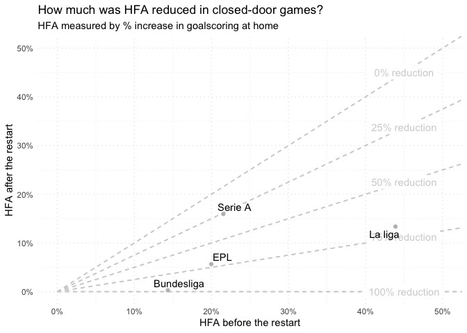
1: For ratios (HFA disruption plot)

The first example comes from a previous post, investigating potential disruption to home advantage pre/post-covid:

(See the end of the previous post for the ggplot2 implementation.)

In general, this kind of approach can be useful when the ratio between the x- and y-measures is meaningful.

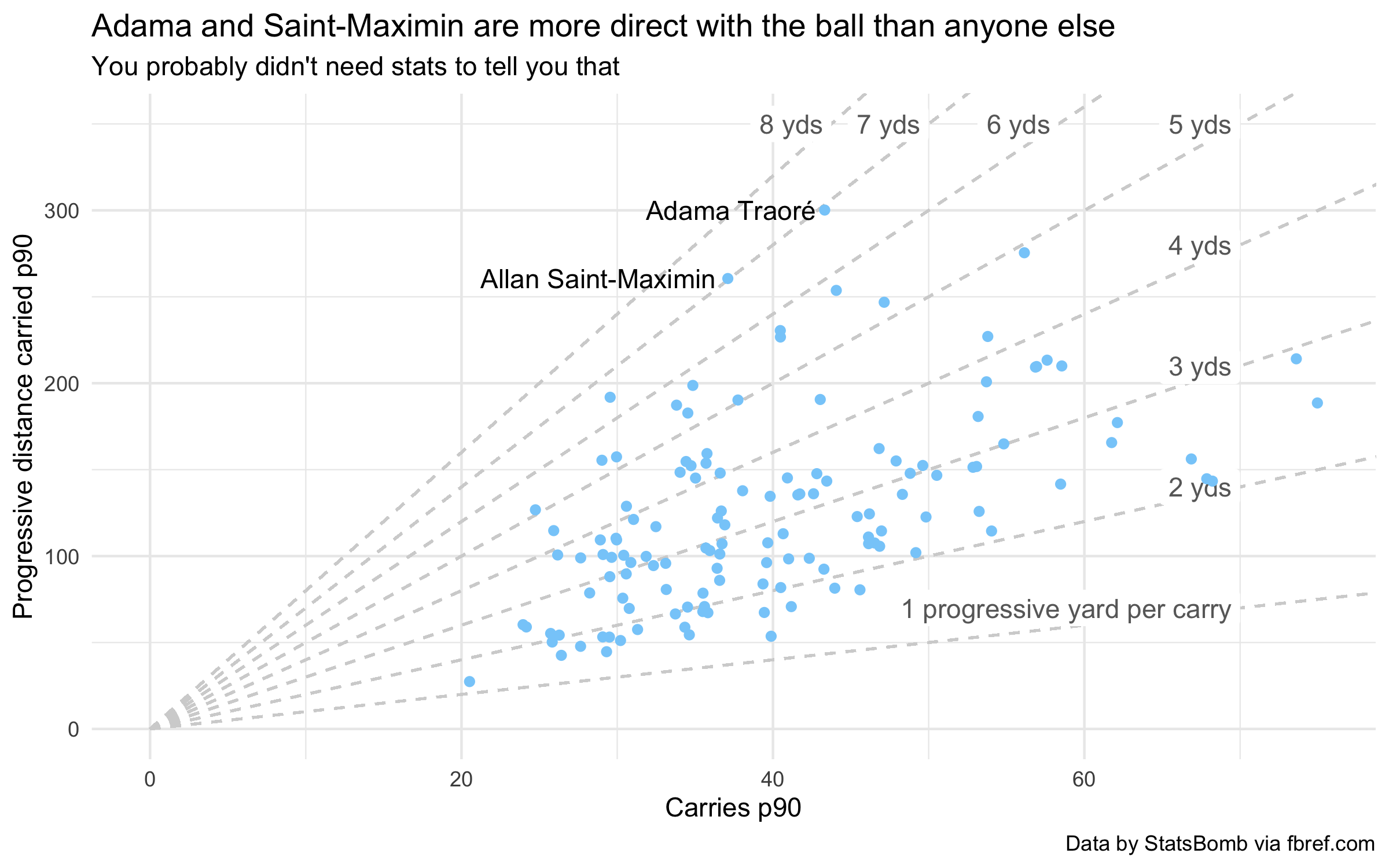
Another potential place to apply this is the “p90 scatter” charts that are common on social media. These charts often consist of a scatter plot showing a set of football players’ score in 2 correlated metrics (for example, xGp90 and Goals p90), with the outliers annotated (these being noteworthy players).

In many cases, the ratio of y/x is useful information. For a scatter of xGp90 against Goals p90, the ratio would be a measure of over/underperformance against xG. On other charts, it may be a success or conversion rate.

This technique can be applied broadly, as long as the ratio of y/x is meaningful. For instance, see how adding diagonal lines to this plot highlights that Adama Traoré and Allan Saint-Maximin had almost the same rate of progressive distance per carry in 2019/20:

Expand for ggplot2 implementation
library(tidyverse)
library(rvest)

# Fetch the FBref data from acciotables
epl_possession_data <-
read_html("http://acciotables.herokuapp.com/?page_url=https://fbref.com/en/comps/9/3232/possession/2019-2020-Premier-League-Stats&content_selector_id=%23stats_possession") %>%
html_table() %>%
.[[1]] %>%
janitor::row_to_names(row_number = 1) %>%
filter(Rk != "Rk") %>%
readr::type_convert()


selected_players <- c(
"Adama Traoré",
"Allan Saint-Maximin"
)

selected_player_data <-
filter(epl_possession_data, Player %in% selected_players)


epl_possession_data %>%
# Get the midfielders with at least 900 minutes played in 19/20
filter(`90s` > 10,
str_detect(Pos, "MF")) %>%
ggplot(aes(x = Carries/`90s`, y = PrgDist/`90s`)) +

# Add the diagonal guidelines and their labels
imap(seq(1, 8, by = 1), function(slope, i) {

# Calculate the position of the labels, such that
# they run along the top horizontally, beyond a
# maximum y value
max_x <- 70
max_y <- 350
label_x <- ifelse(slope*max_x <= max_y, max_x, (max_y / slope))
label_y <- slope*label_x

# Only show the full label for the first annotation
label <- str_glue("{slope} yds")
if (i == 1) {
label <- str_glue("{slope} progressive yard per carry")
}

# Return the layers
list(
geom_segment(x = 0, y = 0, xend = max_x*2, yend = slope*max_x*2, linetype = "dashed", colour = "lightgray"),
annotate(geom = "label", x = label_x, label_y,
label = label, hjust = 1,
colour = "dimgray", label.size = 0)
)
}) +

geom_point(colour = "lightskyblue") +
geom_text(aes(label = Player), hjust = 1.05,
data = selected_player_data) +
theme_minimal() +
coord_cartesian(xlim = c(0, NA), ylim = c(0, NA)) +
scale_x_continuous(labels = scales::number_format(1)) +
scale_y_continuous(labels = scales::number_format(1)) +
labs(title = "Adama and Saint-Maximin are more direct with the ball than anyone else",
subtitle = "You probably didn't need stats to tell you that",
x = "Carries p90",
y = "Progressive distance carried p90",
caption = "Data by StatsBomb via fbref.com")

Diagonal gradients

This specific technique has been extended by Ben Mayhew (@experimental361) quite distinctively by augmenting the diagonal gridlines with a colour gradient, like so:

(Taken from https://twitter.com/experimental361/status/1287746116721795074)

Expand for ggplot2 implementation

I haven’t got a direct ggplot implementation of Mayhew’s colour gradient. However, you can achieve a single-colour gradient by drawing successive semi-transparent polygons over the plot:

library(tidyverse)
library(regista)

# You may need to
# devtools::install_github("torvaney/footballdatr")

epl_match_results <-
footballdatr::fetch_data("england", division = 0, season = 2018) %>%
factor_teams(c("home", "away"))

model <- dixoncoles(hgoal, agoal, home, away, data = epl_match_results)

team_parameters <-
broom::tidy(model) %>%
filter(parameter %in% c("off", "def")) %>%
mutate(value = exp(value)) %>%
spread(parameter, value)

team_parameters %>%
ggplot(aes(x = off, y = def)) +
# THIS IS THE IMPORTANT BIT!
# Add the "gradient" by layering translucent polygons
# NB: This has to go before any plot elements that we
# actually want to see, so that we don't draw over them...
purrr::map(seq(0, 3, length.out = 10), function(m) {
annotate("polygon",
x = c(0, 5, 5, 0),
y = c(0, m*5, 5, 5),
alpha = 1/5,
# Official brand colours from https://www.color-hex.com/color-palette/44426
fill = "#e90052")
}) +
# We need to manually set the axis limits
coord_cartesian(c(1/2, 2), c(1/2, 2)) +
# No source for the official brand font - I guess Roboto will do?
ggrepel::geom_text_repel(aes(label = team),
colour = "#38003c",
family = "Roboto") +
geom_point(alpha = 0.5, colour = "#38003c") +
theme_minimal() +
theme(panel.grid = element_blank(),
text = element_text(family = "Roboto")) +
labs(title = "Team strength estimates",
subtitle = "Premier League 2017/18",
x = "Attack",
y = "Defence")

2: For comparable units (NPG+A plot)

In rarer cases, the x- and y-measures have comparable units. That is, you could meaningfully add the x and y values together. For example, goals and assists are often counted together to create overall “goal contribution” (likewise shots, key passes, and “shot contribution”).

In cases where the sum of the x and y values is useful, a different kind of diagonal grid can be drawn:

The diagonal gridlines here show the overall expected goal contribution (npxG + xA). Two players on the same line will have the same npxG + xA, despite having different npxG or xA figures.

This stratifies the plot elements more meaningfully than standard gridlines and helps readers draw useful comparisons between players.

If we compare to the same plot without gridlines, it is easy to see Di María and Mbappé as outliers and put them in the same tier.

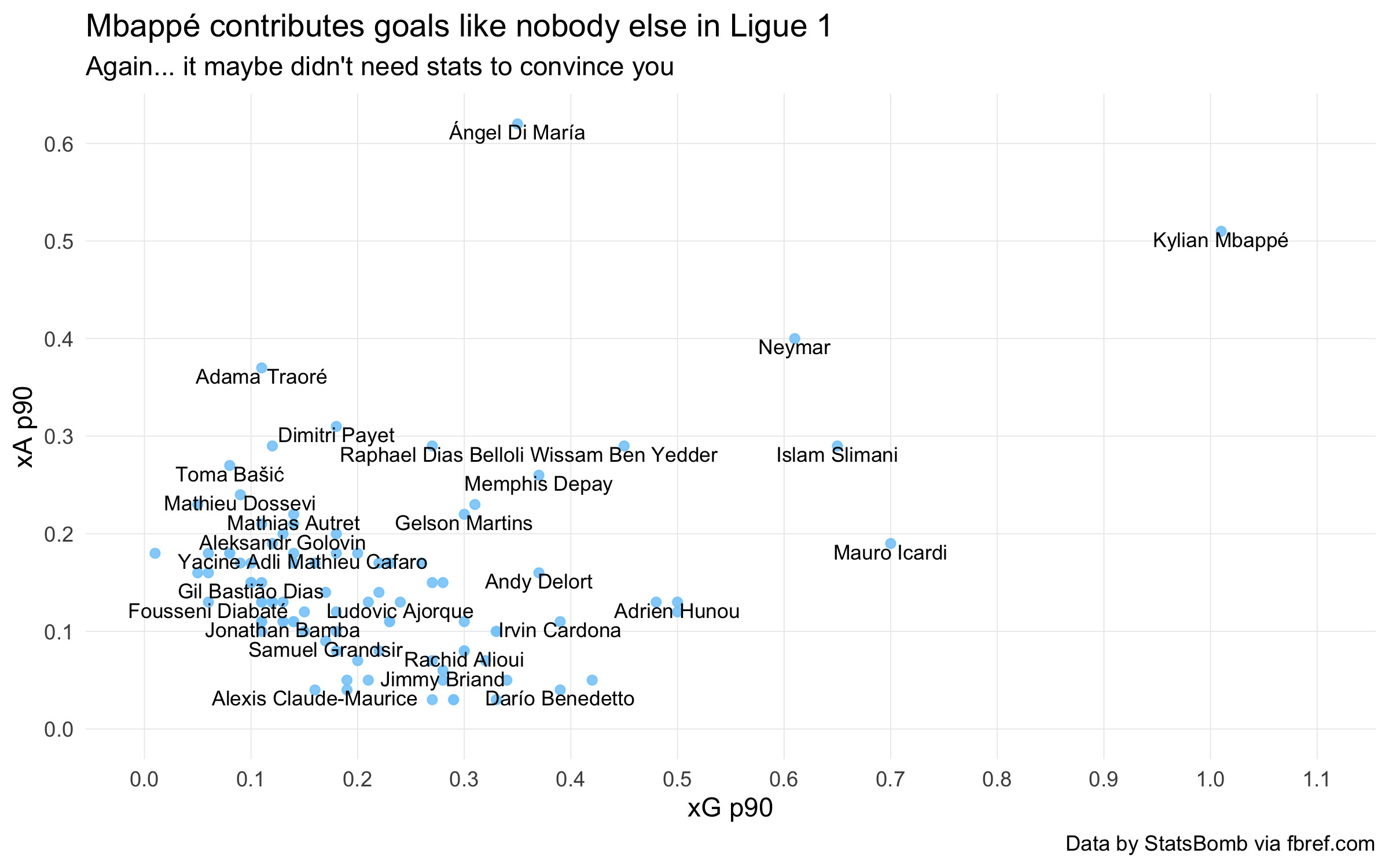
However, this is not true. Mbappé’s goal contribution is a level above that of Di María, Neymar, Slimani, or Icardi; referring back to the first plot, we can see that the latter group all sit within the same tranche.

There is a minor injustice here that xA is harder to come by than xG. Di María’s achievement is rarer and thus perhaps more impressive than Neymar’s (likewise Payet:Cardona, and so on). However, I think that on-balance, the benefits to plot legibility are worth it.

Expand for ggplot2 implementation
library(tidyverse)
library(rvest)


format_colnames <-
. %>%
str_to_lower() %>%
str_replace_all("\\s+", "_")


get_fbref_colnames <- function(data, row_number = 1) {
row_data <- unlist(data[row_number, ])

imap_chr(row_data, function(col_name, parent_name) {
if (parent_name == "") {
return(col_name)
}

paste0(parent_name, "_", col_name)
})
}

fbref_row_to_colnames <- function(data, row_number = 1) {
new_colnames <- get_fbref_colnames(data, row_number)

data %>%
magrittr::set_colnames(new_colnames) %>%
# Rownames are recycled periodically. Remove these
filter(Rk != "Rk")
}


l1_player_data <-
read_html("http://acciotables.herokuapp.com/?page_url=https://fbref.com/en/comps/13/3243/stats/2019-2020-Ligue-1-Stats&content_selector_id=%23stats_standard") %>%
html_table() %>%
.[[1]] %>%
fbref_row_to_colnames() %>%
rename_with(format_colnames) %>%
readr::type_convert()

l1_player_data %>%
filter(playing_time_min >= 10*90,
`per_90_minutes_npxg+xa` >= 0.2) %>%
ggplot(aes(x = per_90_minutes_npxg, y = per_90_minutes_xa)) +

# Add the diagonal gridlines, bounded by the x- and y- axes
map(seq(0, 2, by = 0.1), function(intercept) {
geom_segment(x = 0, y = intercept, xend = intercept, yend = 0, linetype = "dotted", colour = "lightgray")
}) +

geom_point(colour = "lightskyblue", alpha = 0.9) +
geom_text(aes(label = player), check_overlap = TRUE, vjust = 1.05, size = 3) +
theme_minimal() +
theme(panel.grid.major = element_line(size = 0.2),
panel.grid.minor = element_blank()) +
coord_cartesian(xlim = c(0, 1.1), ylim = c(0, NA)) +
scale_x_continuous(breaks = seq(0, 2, by = 0.1), labels = scales::number_format(0.1)) +
scale_y_continuous(breaks = seq(0, 2, by = 0.1), labels = scales::number_format(0.1)) +
labs(title = "Mbappé contributes goals like nobody else in Ligue 1",
subtitle = "Again... it maybe didn't need stats to convince you",
x = "xG p90",
y = "xA p90",
caption = "Data by StatsBomb via fbref.com")

Minor algebraic aside (you can skip this bit)

The formula of a straight line is y = mx + c. Given an x-coordinate, you can find the corresponding y-coordinate on that line by multiplying it by m (the slope) and adding c (the intercept).

You can therefore view the first set of examples as diagonal gridlines where the slope is of interest. In other words, we set gridlines with varying values of m, and a fixed intercept (generally, c will be 0).

In the second category, we are looking at varying the intercept (c), while keeping the slope constant. In our example, m is fixed to -1. This is because we are taking the sum of the x- and y- measures, and re-arranging the formula y + x = c gives us y = (-1)x + c.

If you were interested in the difference between the y- and x- measures, you would draw diagonal gridlines with varying slope and a gradient of +1.

Conclusion

You can use diagonal gridlines liek these to highlight key features of your data in a couple of different cases:

  • When the ratio between x and y is meaningful, you can draw gridlines with varying slope
  • When the x- and y-axes have comparable units, you can draw gridlines with a varying intercept